

How To Create A Navigation Bar In Android Studio
In Common Navigation Paradigms cliffnotes, we discuss the various navigational structures available within Android apps. One of the most flexible is the Navigation Drawer. During the I/O Conference 2015, Google released NavigationView, which makes it far easier to create it than the previously documented instructions.
With the release of Android 5.0 Lollipop, the new material design style navigation drawer spans the full height of the screen and is displayed over the ActionBar and overlaps the translucent StatusBar. Read the material design style navigation drawer document for specs on styling your navigation drawer.

Usage
This guide explains how to setup a basic material design style drawer filled with navigation items that switch different fragments into the content area. In this way, you can define multiple fragments, and then define the list of options which will display in the drawers items list. Each item when clicked will switch the relevant fragment into the activity's container view.
Setup
Make sure to setup the Google Design Support Library before using Google's new NavigationView, announced as part of the Android M release. The NavigationView should be backwards compatible with all versions down to Android 2.1.
Make sure you have this Gradle dependency added to your app/build.gradle file:
dependencies { implementation 'com.google.android.material:material:1.0.0' } Download Nav Drawer Item icons
Download the following icons and add them to your drawable folders by copying and pasting them into the drawable folder or using the New Image Asset dialog to create versions for each density.
- ic_one
- ic_two
- ic_three
If you use the New Image Asset dialog, choose a black foreground color and change the resource name.

Setup Drawer Resources
Create a menu/drawer_view.xml file:
<menu xmlns:android= "http://schemas.android.com/apk/res/android" > <group android:checkableBehavior= "single" > <item android:id= "@+id/nav_first_fragment" android:icon= "@drawable/ic_one" android:title= "First" /> <item android:id= "@+id/nav_second_fragment" android:icon= "@drawable/ic_two" android:title= "Second" /> <item android:id= "@+id/nav_third_fragment" android:icon= "@drawable/ic_three" android:title= "Third" /> </group> </menu> Note that you can set one of these elements to be default selected by using android:checked="true".
You can also create subheaders too and group elements together:
<item android:title= "Sub items" > <menu> <group android:checkableBehavior= "single" > <item android:icon= "@drawable/ic_dashboard" android:title= "Sub item 1" /> <item android:icon= "@drawable/ic_forum" android:title= "Sub item 2" /> </group> </menu> </item> 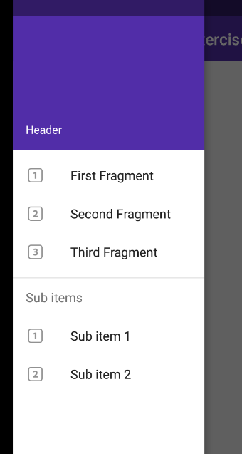
Define Fragments
Next, you need to define your fragments that will be displayed within the activity. These can be any support fragments you define within your application. Make sure that all the fragments extend from androidx.fragment.app.Fragment.
Setup Toolbar
In order to slide our navigation drawer over the ActionBar, we need to use the new Toolbar widget as defined in the AndroidX library. The Toolbar can be embedded into your view hierarchy which makes sure that the drawer slides over the ActionBar.
Create a new layout file res/layout/toolbar.xml with the following code:
<androidx.appcompat.widget.Toolbar xmlns:android= "http://schemas.android.com/apk/res/android" xmlns:app= "http://schemas.android.com/apk/res-auto" android:id= "@+id/toolbar" android:layout_height= "wrap_content" android:layout_width= "match_parent" android:fitsSystemWindows= "true" android:minHeight= "?attr/actionBarSize" app:theme= "@style/ThemeOverlay.AppCompat.Dark.ActionBar" android:background= "?attr/colorPrimaryDark" > </androidx.appcompat.widget.Toolbar> Note that when the android:fitsSystemWindows attribute is set to true for a view, the view would be laid out as if the StatusBar and the ActionBar were present i.e. the UI on top gets padding enough to not be obscured by the navigation bar. Without this attribute, there is not enough padding factored into consideration for the ToolBar:
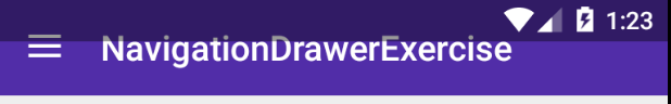
We want our main content view to have the navigation bar and hence android:fitsSystemWindows is set to true for the Toolbar.
To use the Toolbar as an ActionBar, you need to disable the default ActionBar. This can be done by setting the app theme in styles.xml file.
<resources> <!-- Base application theme. --> <style name= "AppTheme" parent= "Theme.AppCompat.Light.NoActionBar" > <item name= "colorPrimary" >#673AB7</item> <item name= "colorPrimaryDark" >#512DA8</item> <item name= "colorAccent" >#FF4081</item> </style> </resources> Also note that normally you should decide on your color scheme by going to Material Palette and choosing a primary and dark primary color. For this example, we will pick purple-based colors as shown in the screenshot.
Note: If you forget to disable the ActionBar in styles.xml, you are likely to see a java.lang.IllegalStateException with an error message that reads This Activity already has an action bar supplied by the window decor. Do not request Window.FEATURE_ACTION_BAR and set windowActionBar to false in your theme to use a Toolbar instead. If you see this message, you need to make sure to follow the previous steps.
Setup Drawer in Activity
Next, let's setup a basic navigation drawer based on the following layout file which has the entire drawer setup in res/layout/activity_main.xml. Note that the Toolbar is added as the first child of the main content view by adding the include tag. Note: if you are using a CoordinatorLayout, it must not lie outside of the DrawerLayout. See https://stackoverflow.com/questions/32523188/coordinatorlayout-appbarlayout-navigationdrawer
<!-- This DrawerLayout has two children at the root --> <androidx.drawerlayout.widget.DrawerLayout xmlns:android= "http://schemas.android.com/apk/res/android" xmlns:app= "http://schemas.android.com/apk/res-auto" android:id= "@+id/drawer_layout" android:layout_width= "match_parent" android:layout_height= "match_parent" > <!-- This LinearLayout represents the contents of the screen --> <LinearLayout android:layout_width= "match_parent" android:layout_height= "match_parent" android:orientation= "vertical" > <!-- The ActionBar displayed at the top --> <include layout= "@layout/toolbar" android:layout_width= "match_parent" android:layout_height= "wrap_content" /> <!-- The main content view where fragments are loaded --> <FrameLayout android:id= "@+id/flContent" app:layout_behavior= "@string/appbar_scrolling_view_behavior" android:layout_width= "match_parent" android:layout_height= "match_parent" /> </LinearLayout> <!-- The navigation drawer that comes from the left --> <!-- Note that `android:layout_gravity` needs to be set to 'start' --> <com.google.android.material.navigation.NavigationView android:id= "@+id/nvView" android:layout_width= "wrap_content" android:layout_height= "match_parent" android:layout_gravity= "start" android:background= "@android:color/white" app:menu= "@menu/drawer_view" /> </androidx.drawerlayout.widget.DrawerLayout> Now, let's setup the drawer in our activity. We can also setup the menu icon too.
public class MainActivity extends AppCompatActivity { private DrawerLayout mDrawer ; private Toolbar toolbar ; private NavigationView nvDrawer ; // Make sure to be using androidx.appcompat.app.ActionBarDrawerToggle version. private ActionBarDrawerToggle drawerToggle ; @Override protected void onCreate ( Bundle savedInstanceState ) { super . onCreate ( savedInstanceState ); setContentView ( R . layout . activity_main ); // Set a Toolbar to replace the ActionBar. toolbar = ( Toolbar ) findViewById ( R . id . toolbar ); setSupportActionBar ( toolbar ); // This will display an Up icon (<-), we will replace it with hamburger later getSupportActionBar (). setDisplayHomeAsUpEnabled ( true ); // Find our drawer view mDrawer = ( DrawerLayout ) findViewById ( R . id . drawer_layout ); } @Override public boolean onOptionsItemSelected ( MenuItem item ) { // The action bar home/up action should open or close the drawer. switch ( item . getItemId ()) { case android . R . id . home : mDrawer . openDrawer ( GravityCompat . START ); return true ; } return super . onOptionsItemSelected ( item ); } } Navigating between Menu Items
Setup a handler to respond to click events on the navigation elements and swap out the fragment. This can be put into the activity directly:
public class MainActivity extends AppCompatActivity { // ... @Override protected void onCreate ( Bundle savedInstanceState ) { // ...From section above... // Find our drawer view nvDrawer = ( NavigationView ) findViewById ( R . id . nvView ); // Setup drawer view setupDrawerContent ( nvDrawer ); } private void setupDrawerContent ( NavigationView navigationView ) { navigationView . setNavigationItemSelectedListener ( new NavigationView . OnNavigationItemSelectedListener () { @Override public boolean onNavigationItemSelected ( MenuItem menuItem ) { selectDrawerItem ( menuItem ); return true ; } }); } public void selectDrawerItem ( MenuItem menuItem ) { // Create a new fragment and specify the fragment to show based on nav item clicked Fragment fragment = null ; Class fragmentClass ; switch ( menuItem . getItemId ()) { case R . id . nav_first_fragment : fragmentClass = FirstFragment . class ; break ; case R . id . nav_second_fragment : fragmentClass = SecondFragment . class ; break ; case R . id . nav_third_fragment : fragmentClass = ThirdFragment . class ; break ; default : fragmentClass = FirstFragment . class ; } try { fragment = ( Fragment ) fragmentClass . newInstance (); } catch ( Exception e ) { e . printStackTrace (); } // Insert the fragment by replacing any existing fragment FragmentManager fragmentManager = getSupportFragmentManager (); fragmentManager . beginTransaction (). replace ( R . id . flContent , fragment ). commit (); // Highlight the selected item has been done by NavigationView menuItem . setChecked ( true ); // Set action bar title setTitle ( menuItem . getTitle ()); // Close the navigation drawer mDrawer . closeDrawers (); } // ... } Add Navigation Header

The NavigationView also accepts a custom attribute that can reference a layout that provides a header of our layout. For instance, you can create a layout/nav_header.xml similar to the following:
<LinearLayout xmlns:android= "http://schemas.android.com/apk/res/android" android:layout_width= "match_parent" android:layout_height= "192dp" android:background= "?attr/colorPrimaryDark" android:padding= "16dp" android:theme= "@style/ThemeOverlay.AppCompat.Dark" android:orientation= "vertical" android:gravity= "bottom" > <TextView android:layout_width= "match_parent" android:layout_height= "wrap_content" android:text= "Header" android:textColor= "@android:color/white" android:textAppearance= "@style/TextAppearance.AppCompat.Body1" /> </LinearLayout> You would then reference this in the layout res/layout/activity_main.xml in the NavigationView with the app:headerLayout custom attribute:
<!-- res/layout/activity_main.xml --> <!-- The navigation drawer --> <com.google.android.material.navigation.NavigationView ... app:headerLayout= "@layout/nav_header" > </com.google.android.material.navigation.NavigationView> This app:headerLayout inflates the specified layout into the header automatically. This can alternatively be done at runtime with:
// Lookup navigation view NavigationView navigationView = ( NavigationView ) findViewById ( R . id . nvView ); // Inflate the header view at runtime View headerLayout = navigationView . inflateHeaderView ( R . layout . nav_header ); // We can now look up items within the header if needed ImageView ivHeaderPhoto = headerLayout . findViewById ( R . id . imageView ); Getting references to the header
If you need to get a reference to the header, you need to use the new getHeaderView() method. Note, that you have to check the header count in order to avoid NPE!
// There is usually only 1 header view. // Multiple header views can technically be added at runtime. // We can use navigationView.getHeaderCount() to determine the total number. if ( navigtationView . getHeaderCount () > 0 ) { // avoid NPE by first checking if there is at least one Header View available View headerLayout = navigationView . getHeaderView ( 0 ); } Animate the Hamburger Icon

In order for the hamburger icon to animate to indicate the drawer is being opened and closed, we need to use the ActionBarDrawerToggle class.
In your res/values/strings.xml add the following:
<?xml version="1.0" encoding="utf-8"?> <resources> <string name= "drawer_open" >Open navigation drawer</string> <string name= "drawer_close" >Close navigation drawer</string> </resources> We need to tie the DrawerLayout and Toolbar together:
protected void onCreate ( Bundle savedInstanceState ) { // Set a Toolbar to replace the ActionBar. toolbar = ( Toolbar ) findViewById ( R . id . toolbar ); setSupportActionBar ( toolbar ); getSupportActionBar (). setDisplayHomeAsUpEnabled ( true ); // Find our drawer view mDrawer = ( DrawerLayout ) findViewById ( R . id . drawer_layout ); drawerToggle = setupDrawerToggle (); // Setup toggle to display hamburger icon with nice animation drawerToogle . setDrawerIndicatorEnabled ( true ); drawerToggle . syncState (); // Tie DrawerLayout events to the ActionBarToggle mDrawer . addDrawerListener ( drawerToggle ); } private ActionBarDrawerToggle setupDrawerToggle () { // NOTE: Make sure you pass in a valid toolbar reference. ActionBarDrawToggle() does not require it // and will not render the hamburger icon without it. return new ActionBarDrawerToggle ( this , mDrawer , toolbar , R . string . drawer_open , R . string . drawer_close ); } Next, we need to make sure we synchronize the state whenever the screen is restored or there is a configuration change (i.e screen rotation):
// `onPostCreate` called when activity start-up is complete after `onStart()` // NOTE 1: Make sure to override the method with only a single `Bundle` argument // Note 2: Make sure you implement the correct `onPostCreate(Bundle savedInstanceState)` method. // There are 2 signatures and only `onPostCreate(Bundle state)` shows the hamburger icon. @Override protected void onPostCreate ( Bundle savedInstanceState ) { super . onPostCreate ( savedInstanceState ); // Sync the toggle state after onRestoreInstanceState has occurred. drawerToggle . syncState (); } @Override public void onConfigurationChanged ( Configuration newConfig ) { super . onConfigurationChanged ( newConfig ); // Pass any configuration change to the drawer toggles drawerToggle . onConfigurationChanged ( newConfig ); } We also need to change the onOptionsItemSelected() method and allow the ActionBarToggle to handle the events.
@Override public boolean onOptionsItemSelected ( MenuItem item ) { if ( drawerToggle . onOptionsItemSelected ( item )) { return true ; } return super . onOptionsItemSelected ( item ); } The ActionBarToggle will perform the same function done previously but adds a bit more checks and allows mouse clicks on the icon to open and close the drawer. See the source code for more context.
One thing to note is that the ActionBarDrawerToggle renders a custom DrawerArrowDrawable for you for the hamburger icon.
Also, make sure to be using androidx.appcompat.app.ActionBarDrawerToggle version.
Making Status Bar Translucent

To have the status bar translucent and have our drawer slide over it, we need to set android:windowTranslucentStatus to true. Because this style is not available for pre Kitkat devices, we'll add res/values-v19/styles.xml file for API version 19 and onwards. Note: If you modify your res/values/styles.xml directly with this android:windowTranslucentStatus line, you are likely to need to build only for SDK versions 19 or higher, which will obviously limit you from supporting many older devices.
Note many apps and developers switched to use minSdkVersion=21. It covers ~85% of Android devices worldwide as of 2019.
In res/values-v19/styles.xml we can add the following:
<resources> <!-- Base application theme. --> <style name= "AppTheme" parent= "Theme.AppCompat.Light.NoActionBar" > <!-- Customize your theme here. --> <item name= "android:windowTranslucentStatus" >true</item> </style> </resources> Now if you run your app, you should see the navigation drawer and be able to select between your fragments.
Adding custom views to navigation drawer
One improvement made to the design support library 23.1.0 is the addition of support for custom views for the navigation drawer items. For instance, we can create a custom switch like the navigation drawer from Google Play Movies for one of the rows:
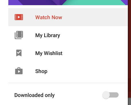
The approach is the same as adding ActionView items to the ActionBar. We simply need to define a separate layout such as the following snippet. We will call this file action_view_switch.xml:
<?xml version="1.0" encoding="utf-8"?> <LinearLayout xmlns:android= "http://schemas.android.com/apk/res/android" android:orientation= "horizontal" android:layout_width= "match_parent" android:layout_height= "match_parent" > <androidx.appcompat.widget.SwitchCompat android:layout_width= "fill_parent" android:layout_height= "match_parent" android:text= "Switch" /> </LinearLayout> We then reference this layout using the app:actionLayout attribute. A title must be provided but can also be set to blank:
<menu xmlns:app= "http://schemas.android.com/apk/res-auto" xmlns:android= "http://schemas.android.com/apk/res/android" > <item android:id= "@+id/nav_switch" app:actionLayout= "@layout/action_view_switch" android:title= "Downloaded only" /> </menu> You can attach events directly in XML so long as your Activity will implement the method. To add an event handling to the toggle switch programmatically through Java, you will need to first get the menu instance and get access to the corresponding ActionView:
Menu menu = navigationView . getMenu (); MenuItem menuItem = menu . findItem ( R . id . nav_switch ); View actionView = MenuItemCompat . getActionView ( menuItem ); actionView . setOnClickListener ( new View . OnClickListener () { @Override public void onClick ( View v ) { } }); Custom widgets using app:actionViewClass can also be used too for menu items as well now too. For more details about how Action Views, see adding the SearchView to ActionBar guide.
Persistent Navigation Drawer
In certain situations, especially on tablets, the navigation drawer should be a permanent fixture on the activity acting as a sidebar:

To achieve this effect, review the following links which describe one approach:
- Static Nav Drawer
- Related Stackoverflow Question
- Sample Code
Third-party libraries may also make this easier to achieve.
Third-Party Libraries
There are a few third-party libraries that are still relevant as possible alternatives to using the DrawerLayout directly which provide certain material design elements automatically:

- MaterialDrawer
- NavigationDrawerMaterial
Often these are unnecessary but check them out to see the functionality they provide.
Limitations
The current version of the design support library does come with its limitations. The main issue is with the system that highlights the current item in the navigation menu. The itemBackground attribute for the NavigationView does not handle the checked state of the item correctly: somehow either all items are highlighted or none of them are. This makes this attribute basically unusable for most apps.
Alternative to Fragments
Although many navigation drawer examples show how fragments can be used with the navigation drawer, you can also use a RelativeLayout/LinearLayout if you wish to use the drawer as an overlay to your currently displayed Activity.
Instead of <FrameLayout> you can substitute that for a <LinearLayout>
<androidx.drawerlayout.widget.DrawerLayout xmlns:android= "http://schemas.android.com/apk/res/android" android:layout_width= "match_parent" android:layout_height= "match_parent" android:id= "@+id/drawer_layout" > <LinearLayout android:id= "@+id/content_frame" android:orientation= "horizontal" android:layout_width= "match_parent" android:layout_height= "match_parent" /> <!-- The navigation drawer --> <ListView android:id= "@+id/left_drawer" android:layout_width= "240dp" android:layout_height= "wrap_content" android:layout_gravity= "start" android:choiceMode= "singleChoice" android:divider= "@android:color/transparent" android:dividerHeight= "0dp" android:background= "#111" /> </androidx.drawerlayout.widget.DrawerLayout> Instead of this:
// Insert the fragment by replacing any existing fragment getFragmentManager (). beginTransaction () . replace ( R . id . content_frame , fragment ) . commit (); You can instead use the LinearLayout container to inflate the Activity directly:
LayoutInflater inflater = getLayoutInflater (); LinearLayout container = ( LinearLayout ) findViewById ( R . id . content_frame ); inflater . inflate ( R . layout . activity_main , container ); References
- https://medium.com/mindorks/upgrading-to-material-components-ebc21ac4e95a
- http://stackoverflow.com/questions/26440879/how-do-i-use-drawerlayout-to-display-over-the-actionbar-toolbar-and-under-the-st
- http://antonioleiva.com/navigation-view/
How To Create A Navigation Bar In Android Studio
Source: https://guides.codepath.com/android/fragment-navigation-drawer
Posted by: martinezdiente.blogspot.com
0 Response to "How To Create A Navigation Bar In Android Studio"
Post a Comment